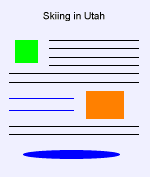


 HTML was originally invented as a way of sharing text-based documents. HTML was given the ability to display graphics, but it did not have the ability to accurately place the graphics at a desired position in the page. The graphics were just placed at the beginning, middle, or ends of lines of text.
 People soon realized that it was difficult to get groups of icons to be aligned in straight rows or columns, because the icons were of different shapes and sizes. Similarly, icons and text, and blocks of text were difficult to align evenly.
Tables Force Alignment
 This alignment problem was solved when HTML was given a table structure in which text and graphics could be placed in "cells" that are formed by the intersection of the rows and columns of the table. Because the cells are aligned correctly, the text and graphics are also aligned. The following example shows an icon and its corresponding caption being aligned by a table having one row and two columns. The icon and the text are centered in the cells of the table.
You will find it helpful to sketch the layout of your pages, showing the approximate placement of text and graphics. | 
|
When using tables for alignment, set the border value to 0 to turn off the borders.
Tables Can Be Nested
 Tables can be nested within tables to give alignment of "groups" of alignment, so to speak. For example, you might want to align several icons and their corresponding captions. Be careful, however, because nested tables are slower loading due to the extra time the browser needs to unravel the tables.
Tables Control Position Within A Page
 Tables can be used to control the positions of text and icons within a page. The page can be filled with a table containing many rows and columns, and icons and text can be placed in the resulting cells. An example of this is the I Love Flags page that contains a table having several rows and columns. Icons and text are scattered throughout the cells to give a "random" appearance to the page. In addition, one row contains a small table to give finer granularity to that row.
Use Tables With Caution
 Tables are a wonderful way to align icons and text, but they create compatibility problems with older browsers and with text-to-speech converters used by blind people. Suggestions how to solve these problems are given in the page on Table Compatibility.
Use CSS
 A better way to control the position of text and graphics is through the use of CSS.
[ Site Map ] [ Distance Learning ][ Home ] [ Up ] [ Editing Pages ] [ Layout Tables ] [ Page Margins ] [ Using XHTML ]


© Copyright 1998, 2011 Allen Leigh